Thursday, 6 October 2016

10 Things I Wish I Knew When I Started My Interior Design Business

10 Things I Wish I Knew When I Started My Interior Design Business 

There are lots of things I wish I knew when I was figuring out how to start an interior design business. When I started my interior design business I spent money on shit I didn't need. I changed my services what seemed like every two minutes and felt like I was running around like a chicken with my head cut off trying to chase every bit of knowledge that could set my business off into stratosphere. There's no shortcuts to success, but if you can start off lean and focus on the important shit, you'll still be in business a year (because your first year is one of the hardest) from now on your way to being a successful interior designer.


 How To Start An Interior Design Business


 1. Just get started. You can do this. But you got to stop thinking all the time and focus on your own lane. I wrote about this here... Be the Hamster or the Hustler.


 2. You need a website and a domain. You're going to be wanting a home base online that people can come to, where you can start banking some SEO juice and gain a following. Buy a domain, install Wordpress and use a free theme.


3. You don't need a portfolio, but you need to start one. I didn't have any residential work because I had just come from the land of commercial interiors. I took pictures of my home and shared them. I also shared all of my designs I made with my Minutes Matter software. Create and share those Olioboards that you can make for free. Now you're building a portfolio.


4. Screw the business cards. If you're going the eDesign way and don't plan on going out to tradeshows or events until you start getting some work in the door, skip the business cards and other stationery. I found direct mail to be expensive and a waste of time.


5. Work from home. More than ever interior designers are working from home and it's totes cool. You don't need to spend money on renting a space. Have client meetings at their home or find a local coffee shop. (Hint: You probably need a business license even if you're working from home though, so check with your city.)


6. You need a contract or a letter of agreement. When you get your first client, you still need to write out a contract. I can't tell you how many problems this will solve when you get to working on a project and project creep rears its ugly head. Check out this book on Amazon: Business and Legal Forms for Interior Designers


7. A blog is a must, but only if you commit to doing it regularly. If you're gonna blog on Wednesday the 4th and then three months later you blog again, well then you need to fucking forget it. That will do more damage than not having a blog in the first place. People will wonder if you are a flake and untrustworthy. I'm telling you it's one of the best (and practically free) things you can do to invest in your business, but it's worth jack if you don't keep up with it. Stumped on what to blog about? I've got you covered with this blogging calendar.
Once you start using a blogging calendar for your decorating blog, you will start to fall back in love with blogging. Or least not curse the day you started your blog anymore. Most interior designers start blogging with all sorts of good intentions. Like they want to post all sorts of cute projects. Then sometimes they feel like posting cute stuff to buy.
So, you start all ambitious and shit. Like you're going to blog every day like a mo fo.
Then you find out blogging every day leaves no time for your business.
Or maybe you found you were starting to run out of things to say.
I have something to solve your problems. This really works. And for the amount of time you put into the front end, it will be well worth your time when you need it throughout the year.
It's a Blogging Calendar...
Some fancy peeps call it an Editorial Calendar.
Create a Spreadsheet or Document and list out the 12 months of the year.
For each of the twelve months mark down 4 spots under it. Each of those four spots representing a week (and yes I know there are some months that "have" five weeks, but you can then adjust to do a two part series when that happens).

Let's start at January. I thought of a general topic of a "Clean Slate". It's a new year, people feel like starting over, yada yada.
Then think of one topic to cover each week. I would do one post on "Closet Organization". If you're a blogging fool, you could do a post on Monday about Closet Systems, on Tuesday about How to Best Organize Clothes, on Wednesday a post about whatever and so on. All related to your "Closet Organization". Or split those each up into on topic per week
January: Clean SlateWeek 1: Closet Organization
Week 2: Kitchen Organization
Week 3: Kid's Room Storage
Week 4: Home Office Organization
Then move on to next month. You'll want to block out about an hour or so to do this.
Benefits to a Blogging Calendar
  1. No more scrambling for something to write about.
  1. Entice your readers with previews of what's coming up next. (Which you couldn't do if you are just flying by the seat of your pants)
  1. Schedule posts that then saves you time.
  1. Updates to your blog lets potential clients see that you are still in business.
Point three is the most awesome sauce part of it for me. When you have all the ideas laid out, then pick a couple days and dedicate them to writing blog posts. Then look at your calendar and schedule what days those babies are going out.
Now you can focus on all of those other things you do every day for your business but knowing that your website is constantly being updated because you put in the effort and time on the front end.

8. A newsletter is uber important. Like really. But go get a Mailchimp account, because that's free up to 2,000 subscribers. Why you should build an email list.


9. No guru knows it all. And they are a liar if they claim to. You can take all sorts of courses and read all sorts of books, but until you get real intimate with your business, no one can really be super helpful to you. This post might really help you. If you feel though like you could use someone to bounce ideas off of, I'm here for you.


10. What interior design services should you offer? Well, if you answered everything you're gonna end up bitter and tired. Read my post on what you should offer. You can do this, and I believe in you. You're awesome and you do have something unique and special to share. Don't doubt yourself (at least not more than 2% of the time) when you are first starting to figure out how to start an interior design business. Take your time and make sure the business decisions you make feel right in your gut.

When I first started my online interior design business I was trying to figure out just what I could offer my clients. Then I realized offering too many things is not a good thing either. But I find it is always good to make a list of possible services, see which ones make your heart flutter and will make you happy to do them for your clients. Those are the ones that will be the sweet spot between you and your interior design business. Here is a list of some interior design services ideas you could offer your e-decorating clients...
  • Paint Colors
  • Space Plan
  • Renderings
  • Mood Boards
  • Shopping Lists
  • Window Treatment Ideas
  • Shopping Lists
  • To Do Lists
Just make sure that these deliverables are key to solving your client's problems.
Saturday, 5 March 2016

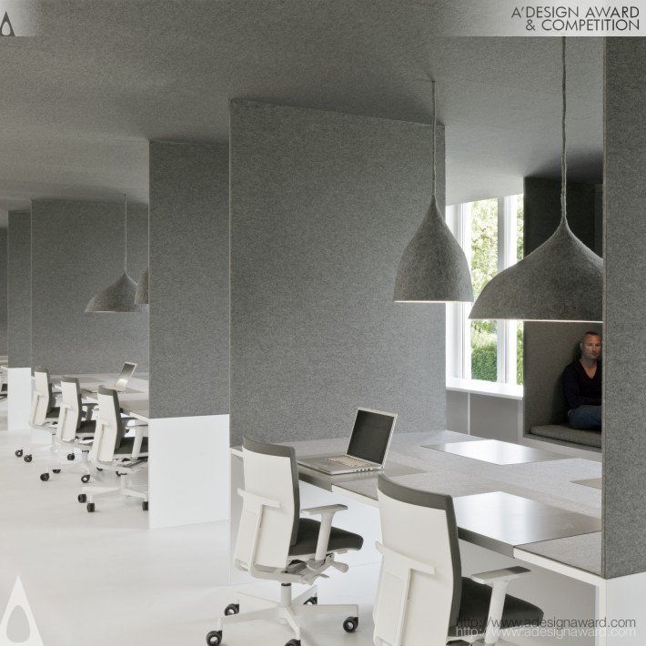
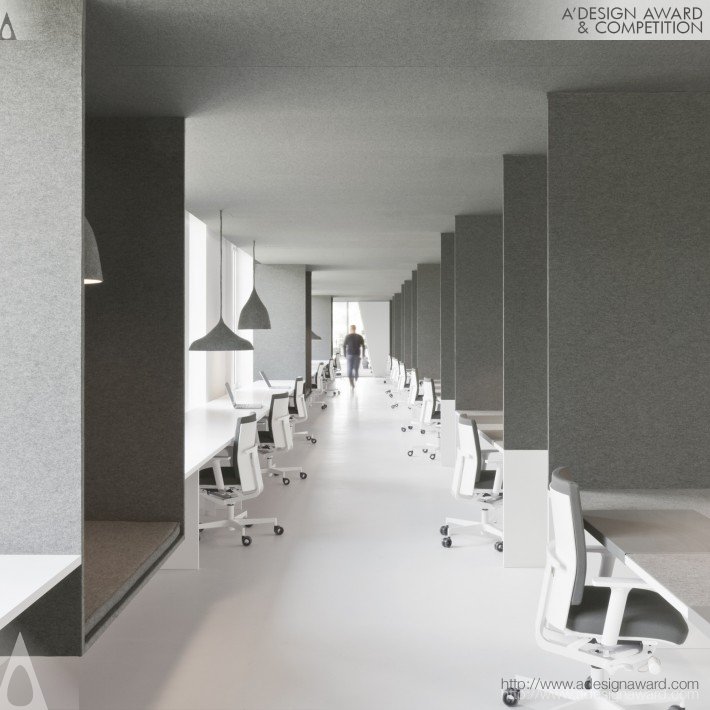
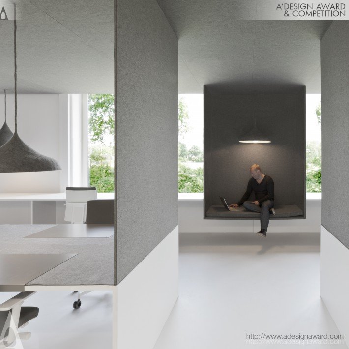
Office 04 Office by I29 Interior Architects

DESIGN DETAILS
DESIGN NAME:
Office 04

PRIMARY FUNCTION:
Office

INSPIRATION:
-

UNIQUE PROPERTIES / PROJECT DESCRIPTION:
As Tribal DDB is part of an international network a clear identity was required, which also fits the parent company DDB. The design had to reflect an identity that is friendly and playful but also professional and serious. This has been succeeded.

OPERATION / FLOW / INTERACTION:
-

PROJECT DURATION AND LOCATION:
-

FITS BEST INTO CATEGORY:
Interior Space and Exhibition Design
PRODUCTION / REALIZATION TECHNOLOGY:
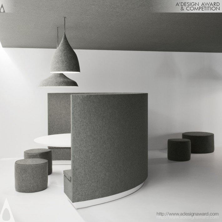
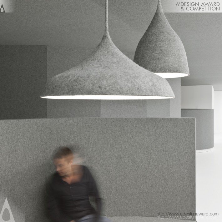
We where led to the use of fabrics. It is playful, and can make a powerful image on a conceptual level, it is perfect for absorbing sound and therefore it creates privacy in open spaces. And we could use it to cover scars of demolition in an effective way. There is probably no other material which can be used on floors, ceiling, walls and to create pieces of furniture and lampshades then felt. It’s also durable, acoustic, fireproof and environment friendly.

SPECIFICATIONS / TECHNICAL PROPERTIES:
450 m2

TAGS:
office design, acoustics, interior i29

RESEARCH ABSTRACT:
-

CHALLENGE:
-

ADDED DATE:
2011-09-28 06:37:19

TEAM MEMBERS (1) :


IMAGE CREDITS:
I29 Interior Architects, 2011.


office-04-by-i29-interior-architects
office-04-by-i29-interior-architects-1
office-04-by-i29-interior-architects-2


office-04-by-i29-interior-architects-4
office-04-by-i29-interior-architects-3


Restaurant Hafen / Susanne Fritz Architekten

  • Architects

  • Location

    Romanshorn, Switzerland
  • Area

    150.0 sqm
  • Project Year

    2015
  • Photographs


  • Location

    Romanshorn, Switzerland


  • At the beginning of 2015, the Swiss lakeport town of Romanshorn and SBS, a Swiss corporate shipping line servicing Lake Constance, created a new, attractive urban space directly along the shoreline. Now a restaurant has been erected on a promenade built into the lake, a locale whose architecture is completely characterised by ships and the seafaring world. Given that the SBS building is protected as an historic landmark, what Susanne Fritz, an interior architect based in Zurich, encountered was a former storeroom that, according to the builders’ wishes, was supposed to be transformed into a spectacular restaurant fully symbolic of nautical science. Five portholes inserted into the side walls with diameters of up to 1.4 metres were envisaged to create transparency vis-à-vis the adjacent premises and optically enlarge the space, which is only around 150 mÇ large. Although a large-scale kitchen to provide catering for the shipping trade is already in place in the rear section of the building, a portion of the restaurant area was sacrificed in favour of a satellite kitchen to keep routes short and workflows efficient. All of the restaurant’s pendant light fixtures are flexibly and adjustably mounted on track lighting systems because seating arrangements at the restaurant vary in winter and summer. In the summertime personnel routes lead through windows that fold back to access the large outdoor terrace with seating for 100. The terrace is spanned by a year-round roofing membrane that provides shade in the summer and keeps it usable when it rains. The windows are shut in the wintertime; more tables are placed inside the restaurant to substitute, creating indoor seating for 80. Keeping in mind that the broadly ranging target group consists of tourists, people in transit from the railway and ferry, families and local business folk, the restaurant has to fulfil the widest variety of needs on the smallest amount of space.

    Thursday, 3 March 2016

    Kitty Burns / Biasol: Design Studio


    © Ari Hatzis© Ari Hatzis© Ari Hatzis© Ari Hatzis

     Nestled below Melbourne’s iconic Skipping Girl, Kitty Burns combines both the tranquility of Yarra Bend with the quirkiness that lies key to both Melbourne design and dining. The Kitty Burns project allowed Biasol: Design Studio to combine their experience in interior, product and branding design to create not only a unique space, but a unique character.

    The Skipping Girl story provided Kitty Burns with a name, while Biasol: Design Studio created a dual personality for the brand. The contrasting elements of the Kitty Burns personality are creatively woven into every design element- Kitty’s fun loving, playful personality, juxtaposed with Burns’ more serious and structured side.

    Challenges presented themselves in the shape of preexisting 6 metre high ceilings. We took this as an opportunity to capitalise on stunning natural light and open space while ensuring a level of intimacy was maintained. To maintain this, we designed three main dining areas to break up the space, creating unique dining experiences that work together cohesively.

    Biasol: Design Studio wanted to establish Kitty Burns as a home away from home for the residents of the Haven apartment complex, a pitched roof design was introduced and incorporated into all elements of the project. We played with both scale and displacement of the roofs, forming a 3D effect that we utilised to create intimacy throughout the various dining spaces. The home concept was also carried through into the brand identity we created for Kitty Burns.

    These pitched roofs also played on the Kitty vs Burns theme - where Burns brings in the physical structure and clean lines, closer inspection reveals that each pitch is at a different height, paying homage to Kitty’s playful side. The lime washed timber bulkheads forming the house shape above the dining areas are lined with three dimensional cladding detail, allowing natural light to create a shadowing effect changing the colour of the timber depending as it receives light. In contrast, the lime washed walls along the seating pods and bar take on a more natural stain allowing these elements to be highlighted within the space with a hierarchy in design and areas of focus.

    We created two main areas of the bar - the coffee bar and the elixir bar, individually housed within framework that ensures each area is distinctly identifiable, aiding on a practical level with ordering and service. The bar is lined with handmade pale turquoise tiles, a nod to Kitty’s more playful side, framed by a strong overhead structure constructed from Australian natural timbers, representing Burns’ more disciplined personality.  Within the coffee bar we have introduced a waiting area for patrons, as well as designing a mobile coffee cart that echoes the design language of the main bar.

    Each element was seriously considered in the context of the space, with Biasol: Design Studio going as far as to custom design and make each pendant light to ensure they conveyed both the playful and serious sides of the brand most effectively. The light fittings were created in copper and white tones, both sympathetic to the overall colour palette of the space. Each light was created in two parts allowing us to mix and match for a playful finish.

    With the tranquil surroundings and views of Melbourne’s iconic Yarra River, it was of the utmost importance that Biasol: Design Studio took advantage of that tranquility to create comfort and a sense of serenity. We introduced a strong element of greenery inside to embrace the surrounding, making the dining spaces feel one with the environment. The space doesn’t compete with the external surrounds, instead choosing to complimenting it.

    Hueso Restaurant / Cadena + Asociados


    • Architects

    • Location

      Efraín González Luna, Guadalajara, JAL, Mexico
    • Project Architect

      Ignacio Cadena
    • Project Year

      2014
    • Photographs

    • Location

      Efraín González Luna, Guadalajara, JAL, Mexico
    © Jaime Navarro© Jaime Navarro© Jaime Navarro© Jaime Navarro

    • Culinary Concept

      Alfonso Cadena
    • Art Direction

      Ignacio Cadena
    • Furniture and Lighting

      Ignacio Cadena
    • Construction Permits

      Javier Monteón
    • Ceramics

      José Noé Suro
    • Artistic Interventions

      Los -Originales- Contratistas, Tomás Guereña & Miguel Ángel Fuentes
    • Graphic Languages

      Rocío Serna
    • Aluminum Molds

      Mauricio & Sebastián Lara
    • Branding and Design Experience

      Cadena Concept Design ®


    The Luis Barragán Foundation and the House and Studio of architect Ignacio Díaz Morales, in the beautiful Lafayette Design District in Guadalajara, Jalisco, are the perfect stage to frame the modern architecture of 1940 of the building that now inhabits "Hueso", a contemporary and avant-garde restaurant, owned by Alfonso Cadena.

    The concept under which it was designed starts from the outside, giving a second skin to the facade of the building, which is now covered by a grid inspired by sewing stitches, made from ceramic mosaics designed by José Noé Suro, which functions as the ideal preamble for an organic interior, rich in texture.

    Inspired in a Darwinian view, the interior walls are filled top to bottom with a collection of over 10,000 animal and plant bones mounted on various layers of wood and intertwined with cooking utensils and other objects that were intervened by urban visual artists.


    In Defense of Renders and Trees On Top of Skyscrapers


    MVRDV's proposal for Ravel Plaza in Amsterdam. Image © A2 Studio


    Though that article did not mention MVRDV in the text, our Peruri88 project in Jakarta was given the dubious distinction of being the article's most prominent image.
    We'd like to discuss this common critique. The point of the role of visualizations in our communication is relevant but, even though we fully understand where the criticism comes from, arguments such as these are in our opinion not correct.
    Every day we are surrounded by countless advertisements; magazine covers show perfect photoshopped women, our food packages depict perfectly yummy salads while containing grey slush and consumers buy expensive lotions that promise a more “radiant skin.” Some architecture critics notice that the render is used in the same way, an empty promise of a future that will turn out much bleaker than the picture. This may be the case in some circumstances and deserves deeper research, but we believe there is a difference between the architectural render and these adverts. Architectural renders are translations of a rather abstract drawing. MVRDV accepted grudgingly to have a visualization department because renders are used as a translation of the architect’s core business, the technical drawing, to make the building understandable to clients and users—not to mention the fact that most newspapers would never publish a technical drawing.
    Years ago, MVRDV communicated their work with screenshots of 3D software onto which black cut-outs of people had been pasted in order to give scale. Since then, the technological standard has been raised; computer games and movies such as Avatar are the new common ground, and even children play games with better graphics than an architect’s 3D software. Because of this, the will or ability to read abstract artist impressions has declined, both with the public and our clients. Renders are a necessity. This is how society works now, whether we like it or not.

    Internally, this led to a long discussion about the right method of communication for design proposals and the style of the render. For a number of years we worked with professional render firms. Chinese firms often excelled in bright Technicolor dreams, while many European studios with impeccable taste made our buildings look cool, but sometimes sombre. The initial render of the Roskilde Rockmuseum, for example, is not half as colorful as the façade turned out to be in reality. We concluded that a stronger link between the visual artists and the design team was needed to be able to develop genuine images that best represent the intentions of our design proposals.
    So we built up our own team, of mostly Italian visual artists, and they have created the renders for our office ever since. This team operates in the small window of opportunity between the end of the design and the deadline of the project. It is a tough job that deals with basic questions of presentation: What effect does the proposal have on its urban surroundings? How can we choose the right perspective to communicate this? How do we show the number of floors even if the façade is opaque? Can we find that exact time of day that the shadow does not obscure details we want to show? The visualization team is in close contact with the architects and they discuss façade details, what kind of people might visit the place and the sizes of trees. This is a strongly iterative and evolutionary process.
    Is the render only used for pitches to clients? It might surprise that in more than half of our projects a render comes after the project is secured, so often it is not even an advertisement as such, but simply a way of communication. In many cases however the render is indeed a tool to convince decision makers, and the render team has to be precise about this as everything in the image is a promise. The suggestion that developers or architects might benefit from deliberately representing a project as more attractive than it will be in reality is short-sighted: the people who pay for architecture, as well as the people who live with it, will look at the images and protest if the reality does not live up to that promise. This is why the render team is in such close contact with the architects.
    Failed Architecture's attack on Amsterdam’s Ravel Plaza, arguing that its lush greenery might in reality not turn out like the render, is in stark contrast to the level of detail and the engineering, qualitative, and financial guarantees given by the developer to the municipality for this particular bid. The aim to develop quality social spaces and integrate plant life in urban settings has been on MVRDV's agenda since the start of our office. In Tim de Chant's article on ArchDaily, Peruri88 was under scrutiny for its roof top parks, and in the Dutch architecture press the forest on the roof of Museum Boijmans van Beuningen Art Depot was discussed. Critics say that buildings don’t provide enough soil for such plants, that the wind is too strong, the smog too vile and basically that the photoshopped nature is green-washing polluting buildings. The fact is that we go to great lengths before these promises are made and (even more importantly) to make these promises happen. It does not come easy but we make it work.
    In 2000 we realized a forest on the 5th floor of a building, the Dutch pavilion at EXPO 2000 in Hannover. This forest is still for the most part alive, despite the fact that the building has been abandoned, because there is enough room for the root system. The balconies of Ravel Plaza will all include deep built-in flower pots, integrated irrigation systems, and plants that are resistant to the Dutch climate and to wind. These measures will be combined with a detailed maintenance system in order to grow the shrubs as seen on the render. Similarly, the concept and success of Peruri88 as a vertical city is widely dependent on the reality of these parks. There are plants that grow in wind and there are plants that grow better in smog—and, it is important to note, the plants on the facades are not proposed as part of the sustainability calculation of the building as Minkjan implies, but simply to add a sense of well-being. The long-standing ambition of MVRDV is to generate quality social spaces and to provide a green “suburban” lifestyle with your own apple-tree in the centre of the city. Densification we see as a necessity in order to fight global warming and create better cities with more services, but at the same time densification needs to offer more pleasant spaces, such as great outdoor spaces with greenery, to attract families and the middle classes back to the city.
    In particular, Ravel Plaza is a comment and turning point in the development of Amsterdam’s CBD Zuidas. The area needed a gentler, humane intervention but still density—it is a CBD after all. The plan is extremely realistic, engineered and was continuously calculated during the competition process in close collaboration with the client, who demanded high spatial quality and has a strong interest in being trustworthy. The guarantee regarding the project's ambition, cost, feasibility and the public access route was promised by OVG in various presentations. Neither MVRDV nor the developer could afford to make a render that is far from reality. Of course the render is still an artist's impression: it has to be precise but is only an educated guess at reality. After all the real thing, the building, is not there yet. But the render with all its flaws is by far a more effective tool for describing a project to the public than merely trying to communicate incomprehensible technical drawings. Can you imagine the public outcry if a building were communicated in a way that only architects would understand?
    Furthermore, the render is also a tool to create enthusiasm for a plan. At the Art Depot the rooftop forest was just an option. How would a forest look on the roof? The idea turned out to be so compelling that extra funding was found to actually create it. If critics see the render as a tool for developers to realize commercial projects, the same critics should also accept its ability to generate more architectural and urban quality.

    In the larger context of global construction, projects such as Ravel Plaza are necessary to lead the way to new housing typologies. In this sense the criticism by Failed Architecture is bizarre: a realistic development that tries to deliver great urban quality is slashed as an example of “digital delusion” while many faceless, generic construction projects in the urban periphery are never discussed in the press. Instead of actually discussing “Failed Architecture,” Minkjan follows the very architecture press he criticizes in writing about the top 2% of modern architecture and not the other 98% that is being produced, a mass of architecture recently defined by Frank Gehry with a rude word and hardly ever mentioned in the press.
    Minkjan states that in these images, “the social implications, political dynamics and internal problems of architecture and spatial production are conveniently left out of the picture.” This is true to the extent that these would be very difficult things to show in an image, however in our most recent monograph “MVRDV Buildings” we revisit our buildings and discuss exactly those issues with the inhabitants, users, politicians and former clients in an attempt to honestly report, and at the same time evaluate, our buildings. To double-check the effect of our promises, one could say. Often this analysis needs time and in architecture time is slower than in other disciplines. Often a construction project takes up to 10 years and then we need one or two years to see how the building functions before we can really call it a success. In the meantime the ambition of each project counts and honestly, shouldn’t we be happy with each attempt to realize vertical gardens and with each attempt to reach a higher quality?
    MVRDV hereby invites Mark Minkjan and Tim De Chant to the opening party of Ravel Plaza, have a drink with us and see whether the promise as given in the render was right. Or even better, let’s water an apple tree on the tenth floor together.