Though that article did not mention MVRDV in the text, our
Peruri88 project in Jakarta was given the dubious distinction of being the article's most prominent image.
We'd like to discuss this common critique. The point of the role of visualizations in our communication is relevant but, even though we fully understand where the criticism comes from, arguments such as these are in our opinion not correct.
Every day we are surrounded by countless advertisements; magazine covers show perfect photoshopped women, our food packages depict perfectly yummy salads while containing grey slush and consumers buy expensive lotions that promise a more “radiant skin.” Some architecture critics notice that the render is used in the same way, an empty promise of a future that will turn out much bleaker than the picture. This may be the case in some circumstances and deserves deeper research, but we believe there is a difference between the architectural render and these adverts. Architectural renders are translations of a rather abstract drawing.
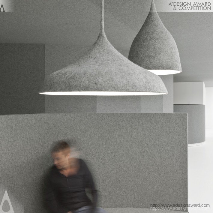
MVRDV accepted grudgingly to have a visualization department because renders are used as a translation of the architect’s core business, the technical drawing, to make the building understandable to clients and users—not to mention the fact that most newspapers would never publish a technical drawing.
Years ago,
MVRDV communicated their work with screenshots of 3D software onto which black cut-outs of people had been pasted in order to give scale. Since then, the technological standard has been raised; computer games and movies such as
Avatar are the new common ground, and even children play games with better graphics than an architect’s 3D software. Because of this, the will or ability to read abstract artist impressions has declined, both with the public and our clients.
Renders are a necessity. This is how society works now, whether we like it or not.

Internally, this led to a long discussion about the right method of communication for design proposals and the style of the render. For a number of years we worked with professional render firms. Chinese firms often excelled in bright Technicolor dreams, while many European studios with impeccable taste made our buildings look cool, but sometimes sombre. The initial render of the Roskilde Rockmuseum, for example, is not half as colorful as the façade turned out to be in reality. We concluded that a stronger link between the visual artists and the design team was needed to be able to develop genuine images that best represent the intentions of our design proposals.
So we built up our own team, of mostly Italian visual artists, and they have created the renders for our office ever since. This team operates in the small window of opportunity between the end of the design and the deadline of the project. It is a tough job that deals with basic questions of presentation: What effect does the proposal have on its urban surroundings? How can we choose the right perspective to communicate this? How do we show the number of floors even if the façade is opaque? Can we find that exact time of day that the shadow does not obscure details we want to show? The visualization team is in close contact with the architects and they discuss façade details, what kind of people might visit the place and the sizes of trees. This is a strongly iterative and evolutionary process.
Is the render only used for pitches to clients? It might surprise that in more than half of our projects a render comes after the project is secured, so often it is not even an advertisement as such, but simply a way of communication. In many cases however the render is indeed a tool to convince decision makers, and the render team has to be precise about this as everything in the image is a promise. The suggestion that developers or architects might benefit from deliberately representing a project as more attractive than it will be in reality is short-sighted: the people who pay for architecture, as well as the people who live with it, will look at the images and protest if the reality does not live up to that promise. This is why the render team is in such close contact with the architects.
Failed Architecture's attack on Amsterdam’s Ravel Plaza, arguing that its lush greenery might in reality not turn out like the render, is in stark contrast to the level of detail and the engineering, qualitative, and financial guarantees given by the developer to the municipality for this particular bid. The aim to develop quality social spaces and integrate plant life in urban settings has been on MVRDV's agenda since the start of our office. In Tim de Chant's article on
ArchDaily, Peruri88 was under scrutiny for its roof top parks, and in the Dutch architecture press the forest on the roof of
Museum Boijmans van Beuningen Art Depot was discussed. Critics say that buildings don’t provide enough soil for such plants, that the wind is too strong, the smog too vile and basically that the photoshopped nature is green-washing polluting buildings. The fact is that we go to great lengths before these promises are made and (even more importantly) to make these promises happen. It does not come easy but we make it work.
In 2000 we realized a forest on the 5th floor of a building, the Dutch pavilion at EXPO 2000 in Hannover. This forest is still for the most part alive, despite the fact that the building has been abandoned, because there is enough room for the root system. The balconies of Ravel Plaza will all include deep built-in flower pots, integrated irrigation systems, and plants that are resistant to the Dutch climate and to wind. These measures will be combined with a detailed maintenance system in order to grow the shrubs as seen on the render. Similarly, the concept and success of Peruri88 as a vertical city is widely dependent on the reality of these parks. There are plants that grow in wind and there are plants that grow better in smog—and, it is important to note, the plants on the facades are not proposed as part of the sustainability calculation of the building as Minkjan implies, but simply to add a sense of well-being. The long-standing ambition of MVRDV is to generate quality social spaces and to provide a green “suburban” lifestyle with your own apple-tree in the centre of the city. Densification we see as a necessity in order to fight global warming and create better cities with more services, but at the same time densification needs to offer more pleasant spaces, such as great outdoor spaces with greenery, to attract families and the middle classes back to the city.
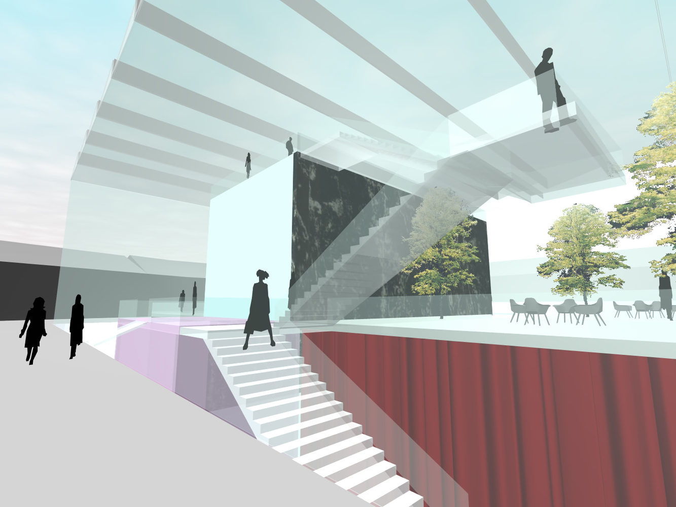
In particular, Ravel Plaza is a comment and turning point in the development of Amsterdam’s CBD Zuidas. The area needed a gentler, humane intervention but still density—it is a CBD after all. The plan is extremely realistic, engineered and was continuously calculated during the competition process in close collaboration with the client, who demanded high spatial quality and has a strong interest in being trustworthy. The guarantee regarding the project's ambition, cost, feasibility and the public access route was promised by OVG in various presentations.
Neither MVRDV nor the developer could afford to make a render that is far from reality. Of course the render is still an artist's impression: it has to be precise but is only an educated guess at reality. After all the real thing, the building, is not there yet. But the render with all its flaws is by far a more effective tool for describing a project to the public than merely trying to communicate incomprehensible technical drawings. Can you imagine the public outcry if a building were communicated in a way that only architects would understand?
Furthermore, the render is also a tool to create enthusiasm for a plan. At the Art Depot the rooftop forest was just an option. How would a forest look on the roof? The idea turned out to be so compelling that extra funding was found to actually create it. If critics see the render as a tool for developers to realize commercial projects, the same critics should also accept its ability to generate more architectural and urban quality.

In the larger context of global construction, projects such as Ravel Plaza are necessary to lead the way to new housing typologies. In this sense the criticism by
Failed Architecture is bizarre: a realistic development that tries to deliver great urban quality is slashed as an example of “digital delusion” while many faceless, generic construction projects in the urban periphery are never discussed in the press. Instead of actually discussing “Failed Architecture,” Minkjan follows the very architecture press he criticizes in writing about the top 2% of modern architecture and not the other 98% that is being produced, a mass of architecture recently
defined by Frank Gehry with a rude word and hardly ever mentioned in the press.
Minkjan states that in these images, “the social implications, political dynamics and internal problems of architecture and spatial production are conveniently left out of the picture.” This is true to the extent that these would be very difficult things to show in an image,
however in our most recent monograph “MVRDV Buildings” we revisit our buildings and discuss exactly those issues with the inhabitants, users, politicians and former clients in an attempt to honestly report, and at the same time evaluate, our buildings. To double-check the effect of our promises, one could say. Often this analysis needs time and in architecture time is slower than in other disciplines.
Often a construction project takes up to 10 years and then we need one or two years to see how the building functions before we can really call it a success. In the meantime the ambition of each project counts and honestly, shouldn’t we be happy with each attempt to realize vertical gardens and with each attempt to reach a higher quality?
MVRDV hereby invites
Mark Minkjan and Tim De Chant to the opening party of Ravel Plaza, have a drink with us and see whether the promise as given in the render was right. Or even better, let’s water an apple tree on the tenth floor together.